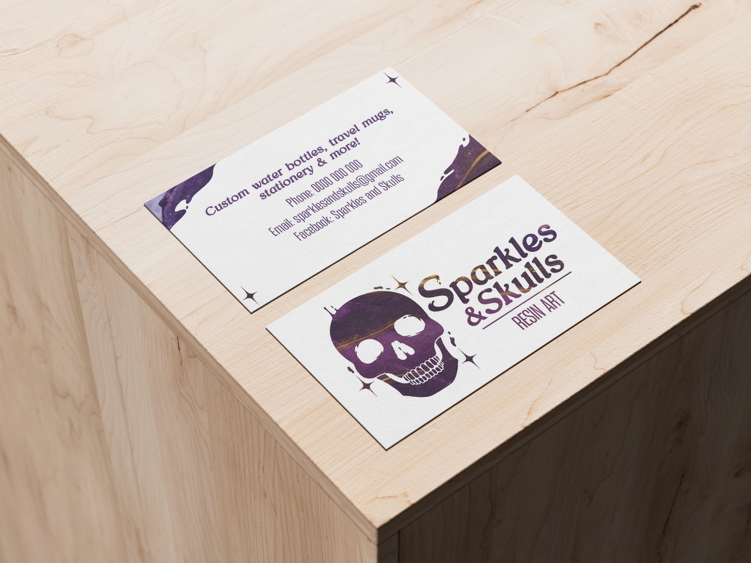
Versatile branding for a humorous homeware business.
Sparkles & Skulls is a family-owned business selling hand-made resin art with a witty, quirky twist. Their goal for this project was to establish a clear brand identity that reflected the vibrant nature of their products. With the business only just starting out, the owners wanted recognisable branding that would spread word of their new endeavour. This project included a logo for both digital and print use, as well as a business card. It was also important that these designs could be translated onto packaging for sending online orders as the business grows.
Sparkles & Skull’s product range is built on their vivid resin-pour art. This technique features the whole colour spectrum coming together in swirls, bubbles and waves. From the beginning of the project, I knew this distinct texture had to be front and centre in my designs. The mood-board featured bright colours, organic and irregular shapes, and curvy typography that mimicked the ripples in resin-pours.
The owners of Sparkles & Skulls pointed to their rough-draft profile pic as a jumping off point for my own designs. It had the colours and elements they were after; it was my job to take it to the next level. Looking at this design, my main takeaways were that the owners didn’t want to shy away from using literal imagery and that the main colour should be a rich purple.
The colour palette is drawn from photography of resin-pour used in the final designs. The key colours are different shades of dark purples, with a bright mustard lending fresh contrast.
Versions of the final designs were created in flat colour. This would later be useful for packaging applications where a pattern wasn’t practical.


